Role
Brand & Packaging Designer
Project Duration
1 Months
Key Developments
Visual Identity, Packaging Design, Brand Storytelling
Challenges
The Prairie Chocolate Co. project began as a college midterm assignment for Intermediate Digital Design Tools, but it quickly evolved into a passion project to craft a distinctive chocolate brand that reflects Canada’s rich landscape and refined taste. The challenge? To create a brand identity and packaging design that conveys an artisanal, high-end feel without explicitly using luxury as a descriptor. This vision guided each design choice, from packaging materials to typography.
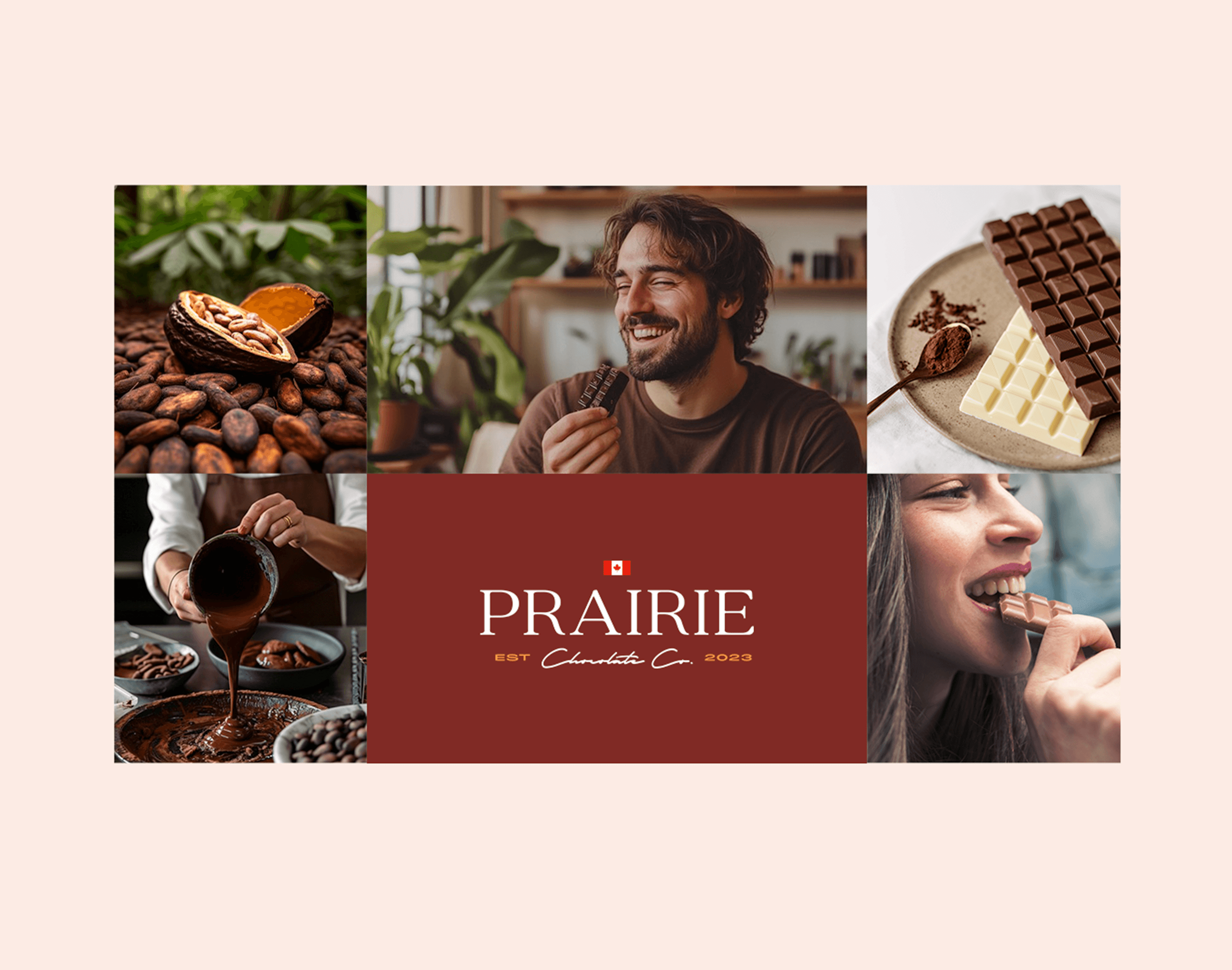
As the sole designer, I focused on building a cohesive visual identity that could resonate across platforms—Facebook, Instagram, Pinterest, and Twitter—while bringing a warm, approachable feel to the luxury market. Packaging played a central role, with each design element chosen to evoke the essence of craftsmanship and elegance. I explored minimalist and organic visuals, aiming to create an experience that feels both luxurious and rooted in the simplicity of high-quality ingredients.
The result was a brand that seamlessly blends rustic charm with refined sophistication, positioning Prairie Chocolate Co. as a standout in the market. This case study represents a culmination of design techniques in art direction, packaging design, and strategic social media placements, each piece working together to build a strong, memorable brand identity.
Takeaways
Crafting a Distinctive Brand Voice
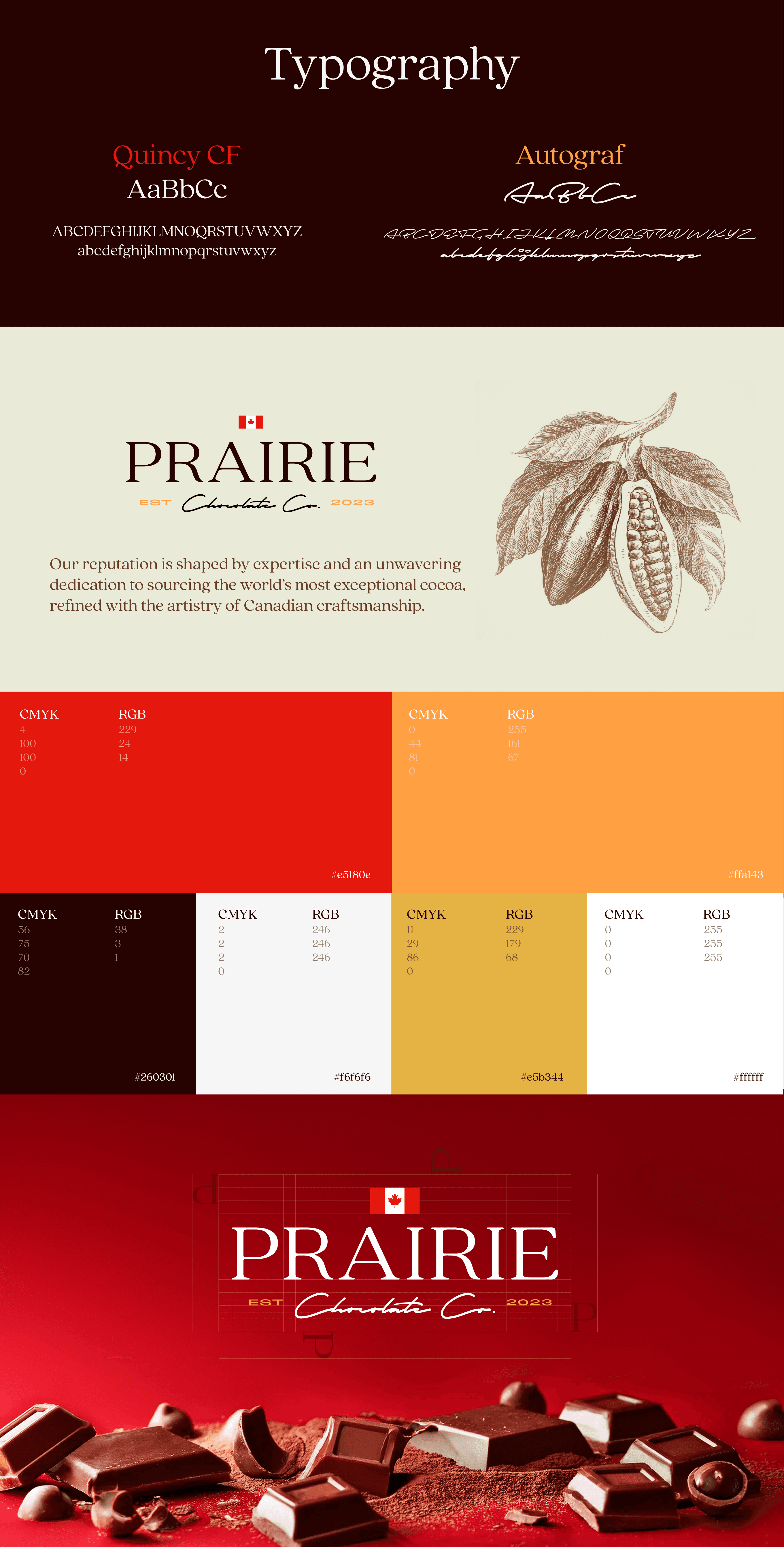
Working on Prairie Chocolate Co. challenged me to build a brand from the ground up, paying attention to the nuanced details that communicate luxury without words. Through a mix of minimalism and rich, earthy tones, I created a visual identity that resonates with premium quality while keeping an artisanal feel. This experience deepened my understanding of how design choices convey brand values and helped me sharpen my ability to create a cohesive visual language that speaks to an audience’s sensibilities.
Developing Multi-Platform Consistency
One of the most critical aspects of this project was ensuring consistency across diverse platforms, from packaging to social media campaigns. I designed packaging that translates well both online and in physical stores, capturing attention through a blend of understated elegance and modern branding. Crafting visuals for social media required a dynamic approach, with each platform’s unique requirements guiding subtle design shifts. This experience refined my skills in adapting core brand aesthetics to varied formats while maintaining a unified look.
Balancing Aesthetics with Brand Strategy
The Prairie Chocolate Co. project allowed me to align visual appeal with strategic brand storytelling, ensuring that each design choice not only looked stunning but also served a purpose. By blending rustic charm with a touch of sophistication, I positioned the brand to stand out in the luxury chocolate market. This project underscored the importance of thinking strategically, aligning each element with brand goals, and finding a balance between artistry and functionality to build a memorable customer experience.


